
Information Architecture Redesign: A State Health Agency Website
LIS 5786 Introduction to Information Architecture, M.S. Information Technology, Florida State University — Spring 2021. Team project, four members; individual contributions noted throughout.
The client and the problem
The South Carolina Department of Health and Environmental Control (scdhec.gov) was a single agency doing two unrelated jobs: public health and environmental regulation. Its website had to serve a parent looking for a vaccination site, a restaurant owner checking food-safety rules, a contractor applying for an environmental permit, and a clinician downloading controlled-substance forms — from one navigation.
In January 2021 it was also at peak pandemic, and Covid content had swallowed the homepage.
What I found in the heuristic evaluation
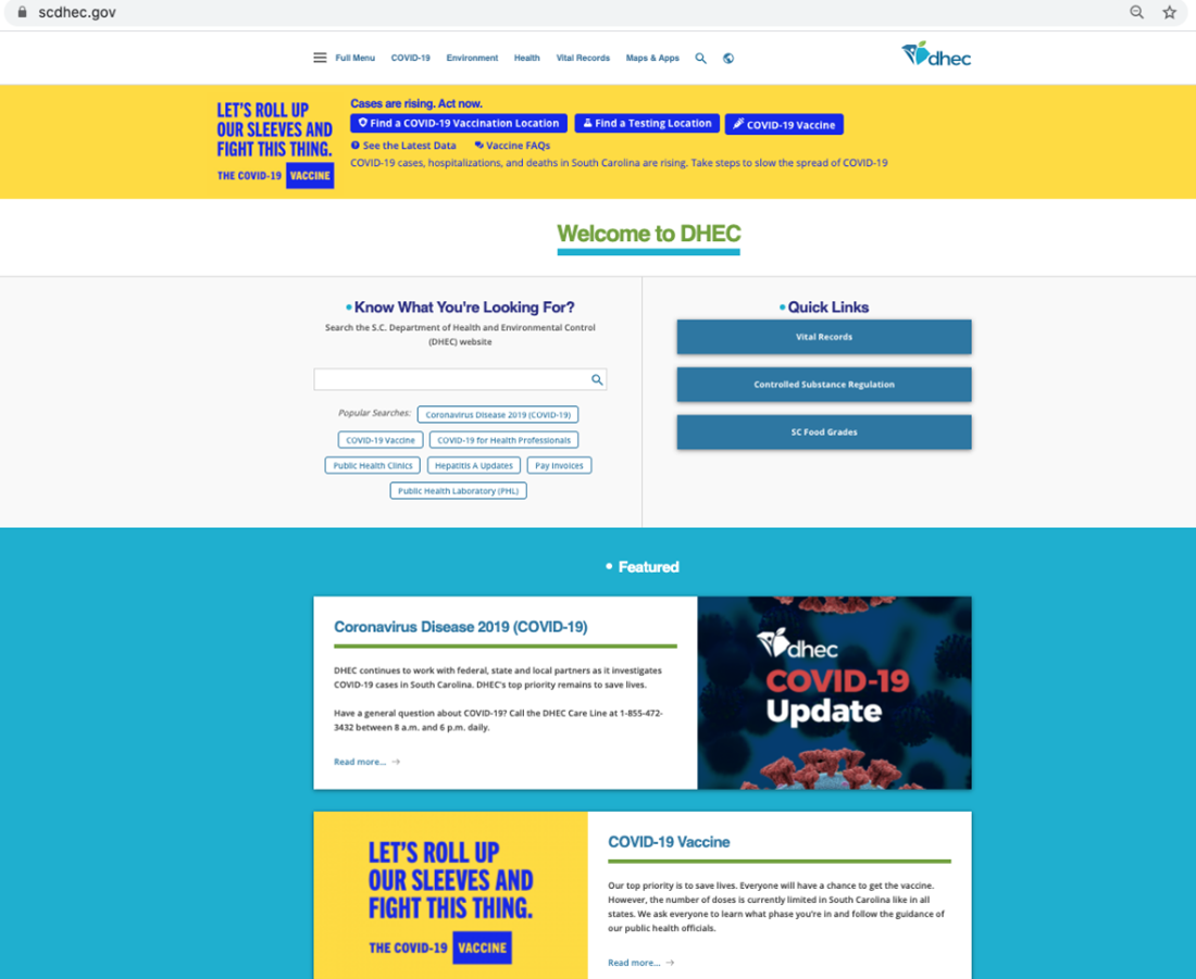
I evaluated the site independently on January 22, 2021, rating fourteen statements across four categories. The pattern was consistent: the site was fine at telling you where you were and bad at telling you where to go.
Worked — the homepage oriented users to the site’s purpose, the sponsoring organization was clearly identified, there were clear calls to action, and there was always a route home.
Didn’t — the homepage failed to highlight the best routes to content, content wasn’t logically organized, the intended audience was unclear, the layout didn’t surface important information, and the labels weren’t meaningful.
Overall rating: poorly designed, difficult to use — the lowest option on the form.
My three recommendations:
- Expand and systematize metadata tags for bottom-up findability. Tags existed but were applied sporadically with little variety.
- Better categorization — possibly separate sub-sites per bureau or department. The content was too diverse to navigate as one thing, and Covid had taken over the site.
- A consistent page template. The upper fold of most pages was consumed by an inaccurate search box and arbitrary “Quick Links,” pushing real content below the scroll.
The research
Users. Three groups, each with incompatible needs:
| Group | Needs | Representative tasks |
|---|---|---|
| Primary — the public | Covid testing and vaccination, vital records, health information, disaster preparedness, food safety | Find a vaccination site; obtain a birth certificate; check a restaurant’s grade |
| Secondary — businesses | Food safety rules, environmental regulations, permitting, business licensing | Apply for a permit; register as a severe-weather cleanup service |
| Tertiary — health and environmental professionals | Clinical guidance, training material, public notices, grants and loans | Report an accident; download forms; file a complaint |
Benchmarking. I analysed the Hawaii Department of Health site as a comparator and found pages loading slowly under high-resolution imagery — which, with a prominent marriage-licence call to action driven by tourism, was a content-delivery problem rather than a design one. Pushing those assets to edge locations would preserve the imagery and fix the speed.
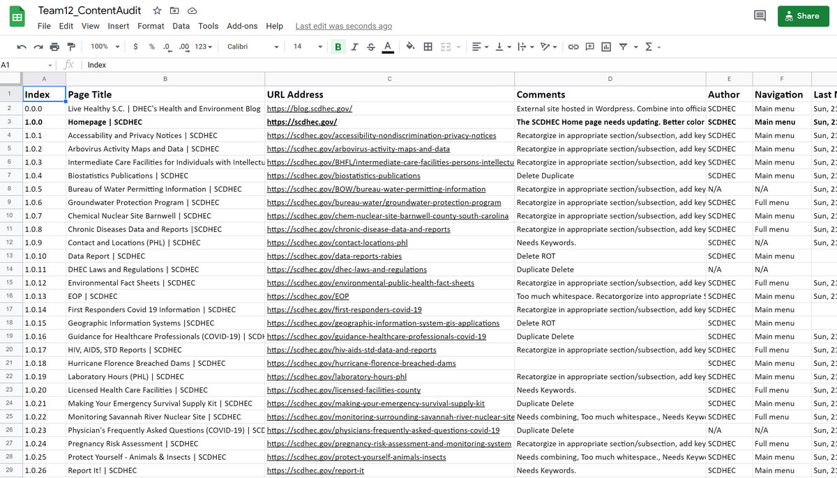
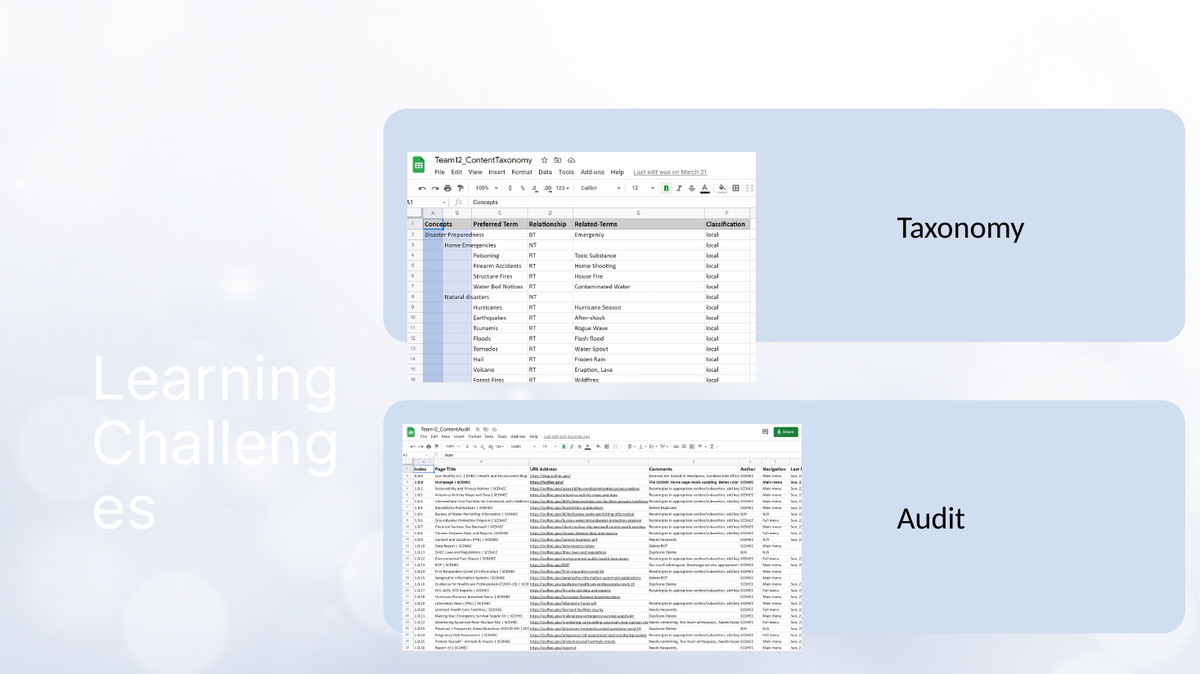
Content audit. The site turned out to hold over 400 pages, far more than we’d estimated. Auditing them was the hardest part of the project — and the most productive, because most pages were either combinable under a better structure or straightforwardly R.O.T.: redundant, outdated, trivial.
Card sorting and taxonomy. We ran a card sort through Optimal Workshop and used the results to build a controlled vocabulary with preferred terms, broader/narrower/related relationships, and classification.
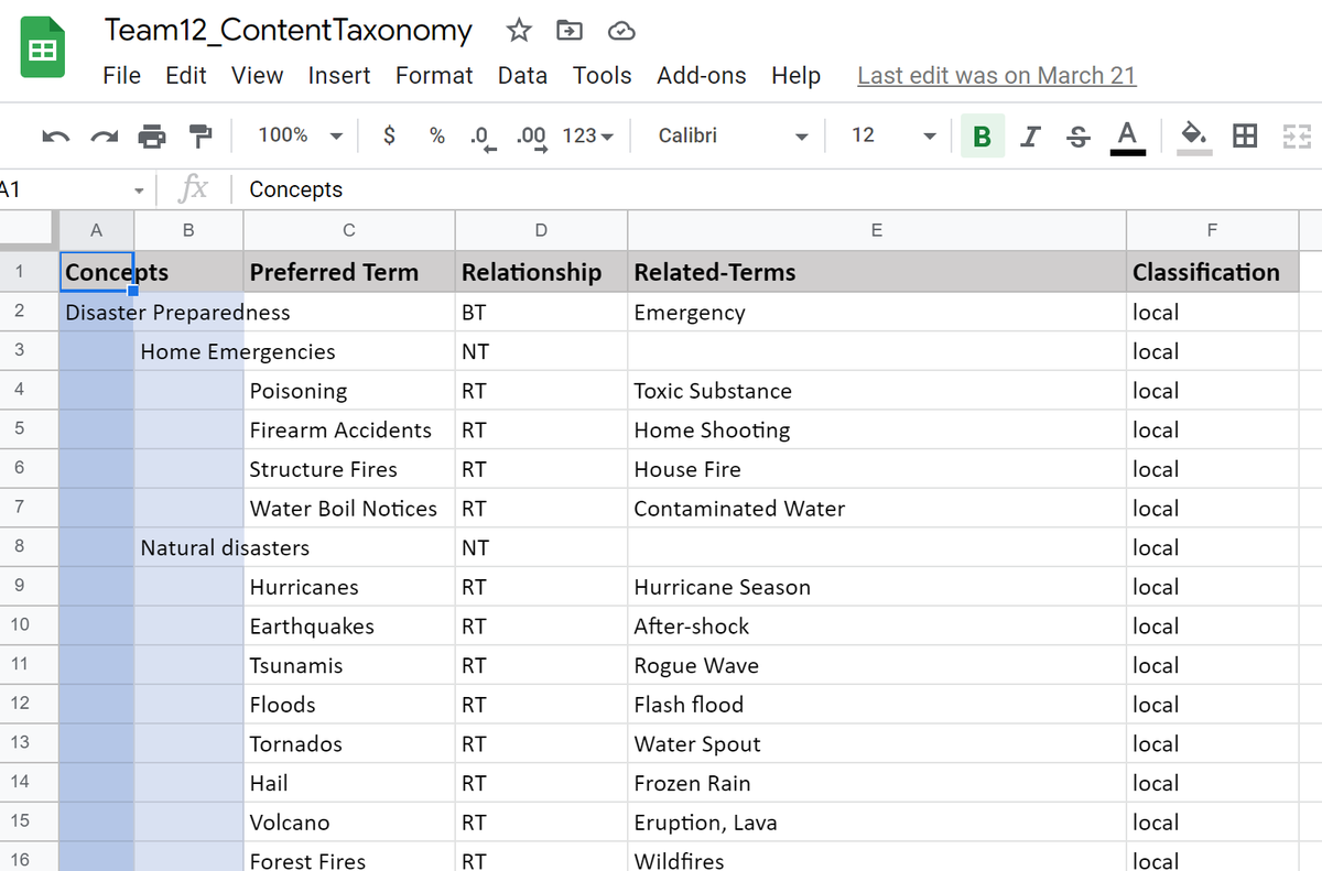
Because the original content was so poorly organised, the taxonomy was difficult to establish at first — the hierarchy had to be derived from user tasks rather than inferred from the existing structure.
The redesign
Sitemap. The original site had none at all.
Wireframes, built in Adobe XD — a tool none of the four of us had used before.
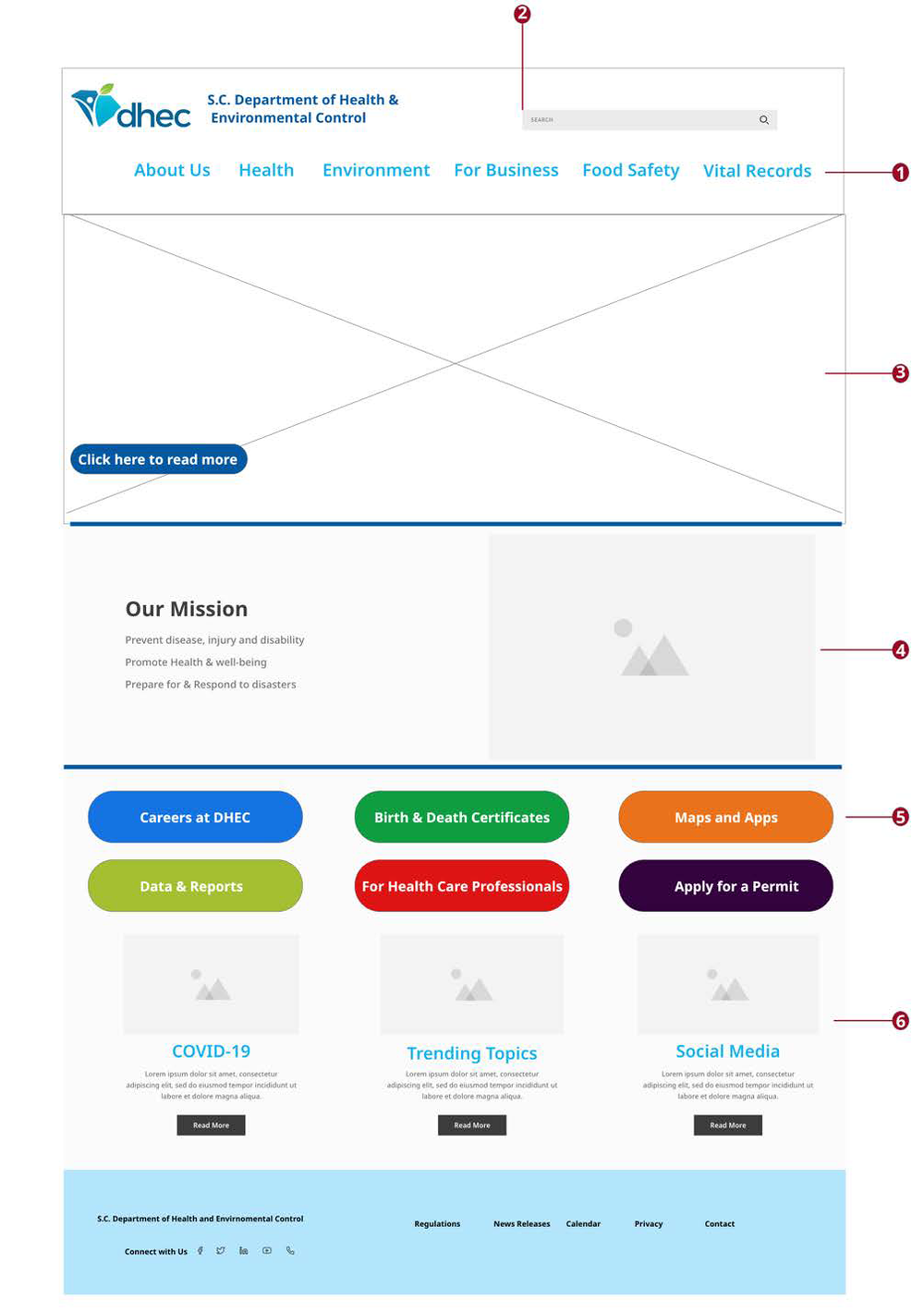
The home page reorganises top-level navigation to include “Contact Us” (previously only reachable from the page footer), adds contextual navigation for the most common user tasks, and uses a highlighted-content module to establish information scent. The DHEC logo moves from the right-hand side to the left, where users expect the route home to be.
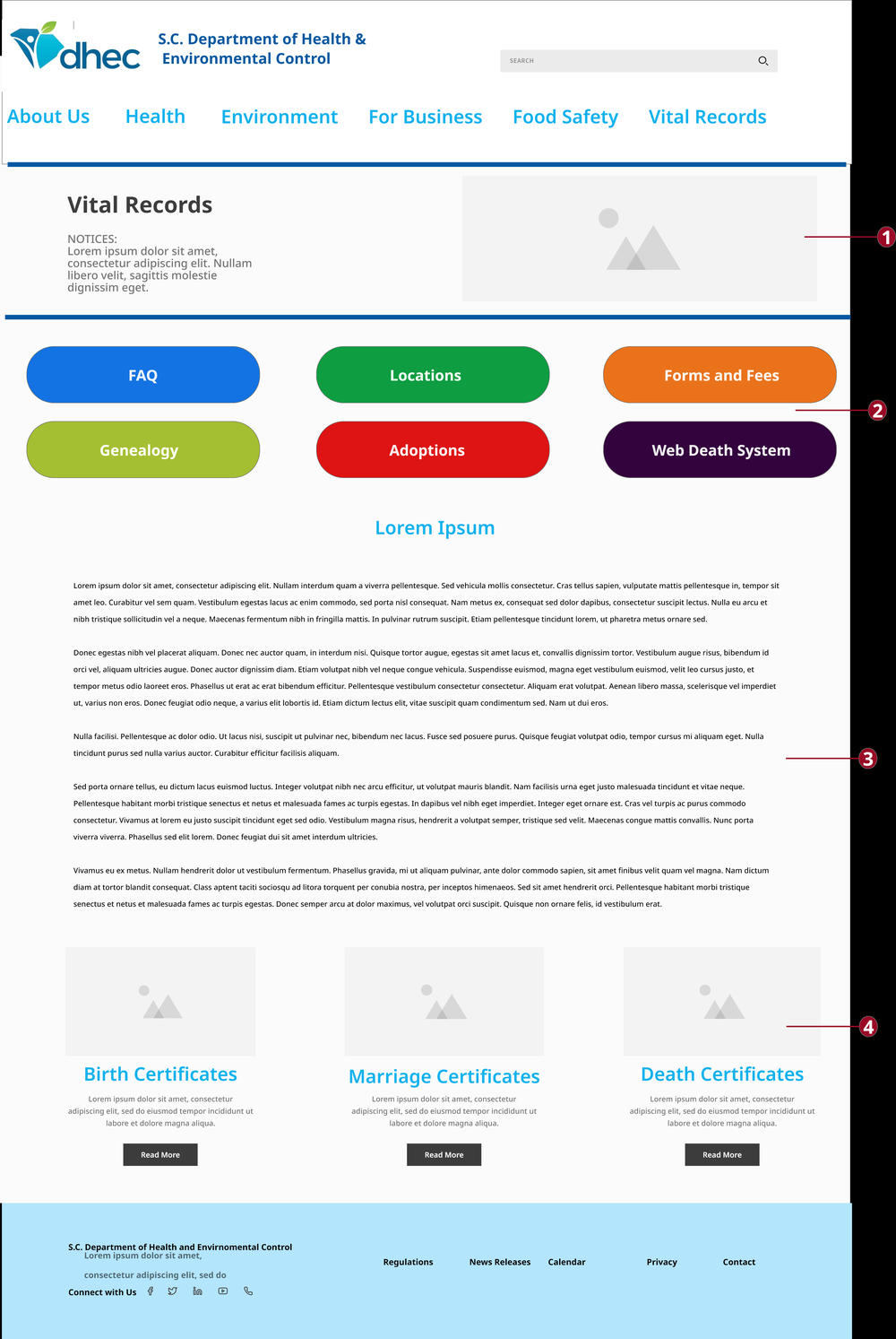
Section pages get a consistent template — subsection header establishing scent, local navigation of related tasks, then content — replacing pages that previously ran endlessly or held almost nothing.
Two decisions I’d defend in a review:
- We considered county-level sub-sites so users could get clinic locations and hours for their area, and rejected them. Location-specific structure made sense for clinics and nothing else on the site, so it would have imposed a geographic hierarchy on content that isn’t geographic.
- We changed how external links were presented, particularly “Apps and Maps” in the global navigation. Users were being carried off to third-party sites while believing they were still on a government one.
What we couldn’t do. We wanted to integrate a third-party accessibility plugin — adjustable text size, contrast, magnification. Properly vetting a third-party integration wasn’t in scope for the project, so we left it out rather than recommend something we hadn’t evaluated. I’d rather have the honest gap than an unverified recommendation.
What happened next
On July 1, 2024, South Carolina split DHEC into two agencies: the Department of Public Health and the Department of Environmental Services. Each now runs its own website. The combined scdhec.gov no longer exists.
I’m not claiming influence — the split was a legislative decision and had nothing to do with a graduate course. But the information architecture was diagnostic. A site resists organisation when the organisation behind it is trying to be two things at once, and the symptoms I was scoring in 2021 — incoherent categorisation, unclear audience, labels that couldn’t be made meaningful because they had to span public health and environmental regulation — were downstream of that. The sub-site split was the version of that fix available to a redesign team. The state eventually made the same split at the level of the agency.
That’s the thing I took from the course and still teach: when a navigation problem refuses to be solved by better labels, the problem usually isn’t the labels.
Deliverables
Project proposal (2,862 words) · heuristic evaluation · user analysis · benchmarking · personas and scenarios · content audit (400+ pages) · card sort · content taxonomy · sitemap · Adobe XD wireframes · final presentation · critical reflection.
Sources on the agency split: SC Department of Public Health — DHEC Restructuring · SC Department of Environmental Services